Step4: Visualization
import pandas as pd
import numpy as np
import seaborn as sns
import matplotlib.pyplot as plt
import glob
import os
import datetime
import matplotlib as mpl
mpl.rcParams['pdf.fonttype'] = 42 #make text in plot editable in AI.


# Hyperparameter
InputFolderName = "./MIBI_TNBC_KNNgraph_Input/"

# Create output folders
OutputFolderName_1 = "./TCN_Plot/"
os.mkdir(OutputFolderName_1)
OutputFolderName_2 = "./CellType_Plot/"
os.mkdir(OutputFolderName_2)
OutputFolderName_3 = "./TargetGraphDF_File/"
os.mkdir(OutputFolderName_3)


#Time_FolderName = glob.glob("*Time*")
# Import region name list.
Region_filename = InputFolderName + "ImageNameList.txt"
region_name_list = pd.read_csv(
        Region_filename,
        sep="\t",  # tab-separated
        header=None,  # no heading row
        names=["Image"],  # set our own names for the columns
    )

print(datetime.datetime.now().strftime('%Y-%m-%d %H:%M:%S'))
Image_FolderName = glob.glob("ImageCollection/*")
for kk in range(0, len(Image_FolderName)):

    print(f"This is Image{kk+1}/{len(Image_FolderName)}")

    # Import graph index.
    GraphIndex_filename = Image_FolderName[kk] + "/GraphIdx_Time1_Fold1.csv"
    graph_index = np.loadtxt(GraphIndex_filename, dtype='int', delimiter=",")

    # Import target graph x/y coordinates.
    region_name = region_name_list.Image[graph_index]
    GraphCoord_filename = InputFolderName + region_name + "_Coordinates.txt"
    x_y_coordinates = pd.read_csv(
            GraphCoord_filename,
            sep="\t",  # tab-separated
            header=None,  # no heading row
            names=["y_coordinate", "x_coordinate"],  # set our own names for the columns
        )
    target_graph_map = x_y_coordinates
    target_graph_map["y_coordinate"] = 0 - target_graph_map["y_coordinate"]  # for consistent with original paper. Don't do this is also ok.

    # Import cell type label.
    CellType_filename = InputFolderName + region_name + "_CellTypeLabel.txt"
    cell_type_label = pd.read_csv(
            CellType_filename,
            sep="\t",  # tab-separated
            header=None,  # no heading row
            names=["cell_type"],  # set our own names for the columns
        )
    # Add cell type labels to target graph x/y coordinates.
    target_graph_map["CellType"] = cell_type_label.cell_type

    #!!! Add consensus cluster labels to target graph x/y coordinates.
    MajorityVoting_FileName = Image_FolderName[kk] + "/ConsensusLabel_MajorityVoting.csv"
    target_graph_map["TCN_MajorityVoting"] = np.loadtxt(MajorityVoting_FileName, dtype='int', delimiter=",")
    # Converting integer list to string list for making color scheme discrete.
    target_graph_map.TCN_MajorityVoting = target_graph_map.TCN_MajorityVoting.astype(str)


    #-----------------------------------------Generate plots-------------------------------------------------#
    # Plot x/y map with "TCN" coloring. Note that consensus clustering result is generated by R with 1-indexing.
    dict_color_TCN = {"1": "#7fc97f", "2": "#beaed4"}
    TCN_MajorityVoting_fig = sns.lmplot(x="x_coordinate", y="y_coordinate", data=target_graph_map, fit_reg=False, hue='TCN_MajorityVoting', legend=False, palette=dict_color_TCN, scatter_kws={"s": 10.0})

    TCN_MajorityVoting_fig.set(xticks=[]) #remove ticks and also tick labels.
    TCN_MajorityVoting_fig.set(yticks=[])
    TCN_MajorityVoting_fig.set(xlabel=None) #remove axis label.
    TCN_MajorityVoting_fig.set(ylabel=None)
    TCN_MajorityVoting_fig.despine(left=True, bottom=True) #remove x(bottom) and y(left) axis.

    '''
    TCN_MajorityVoting_fig.add_legend(label_order = ["1", "2"])
    for lh in TCN_MajorityVoting_fig._legend.legendHandles:
        #lh.set_alpha(1)
        lh._sizes = [15]   # You can also use lh.set_sizes([15])
    #plt.show()
    '''
    # Save the figure.
    TCN_fig_filename = OutputFolderName_1 + "TCN_" + region_name + ".pdf"
    TCN_MajorityVoting_fig.savefig(TCN_fig_filename)
    TCN_fig_filename2 = OutputFolderName_1 + "TCN_" + region_name + ".png"
    TCN_MajorityVoting_fig.savefig(TCN_fig_filename2)


   # Plot x/y map with "CellType" coloring.
    dict_color_CellType = {"CD4T": "#fee08b", "B": "Red", "DC": "Black", "CD8T": "MediumBlue", "CD11c-high": "Purple", "MF_1": "#00A087", \
    "MF/Glia": "#1F77B4", "NK": "#a50026", "Treg": "#FF7F0E", "Other": "#9467BD", "MF_2": "#2CA02C", \
        "Neutrophil": "#8C564B", "Epithelial": "#E377C2", "Mesenchymal/SMA": "#7F7F7F", "Tumor/Keratin": "#543005", "Tumor/EGFR": "#BCBD22", \
            "Endothelial/Vim": "#17BECF"}
    CellType_fig = sns.lmplot(x="x_coordinate", y="y_coordinate", data=target_graph_map, fit_reg=False, hue='CellType', legend=False, palette=dict_color_CellType, scatter_kws={"s": 10.0})

    CellType_fig.set(xticks=[]) #remove ticks and also tick labels.
    CellType_fig.set(yticks=[])
    CellType_fig.set(xlabel=None) #remove axis label.
    CellType_fig.set(ylabel=None)
    CellType_fig.despine(left=True, bottom=True) #remove x(bottom) and y(left) axis.

    '''
    CellType_fig.add_legend(label_order = ["CD4T", "B", "DC", "CD8T", "CD11c-high", "MF_1", \
    "MF/Glia", "NK", "Treg", "Other", "MF_2", \
        "Neutrophil", "Epithelial", "Mesenchymal/SMA", "Tumor/Keratin", "Tumor/EGFR", "Endothelial/Vim"])
    for lh in CellType_fig._legend.legendHandles:
        #lh.set_alpha(1)
        lh._sizes = [15]   # You can also use lh.set_sizes([15])
    '''
    # Save the figure.
    CellType_fig_filename = OutputFolderName_2 + "CellType_" + region_name + ".pdf"
    CellType_fig.savefig(CellType_fig_filename)
    CellType_fig_filename2 = OutputFolderName_2 + "CellType_" + region_name + ".png"
    CellType_fig.savefig(CellType_fig_filename2)


    # Export dataframe: "target_graph_map".
    TargetGraph_dataframe_filename = OutputFolderName_3 + "TargetGraphDF_" + region_name + ".csv"
    target_graph_map.to_csv(TargetGraph_dataframe_filename, na_rep="NULL", index=False) #remove row index.

print(datetime.datetime.now().strftime('%Y-%m-%d %H:%M:%S'))
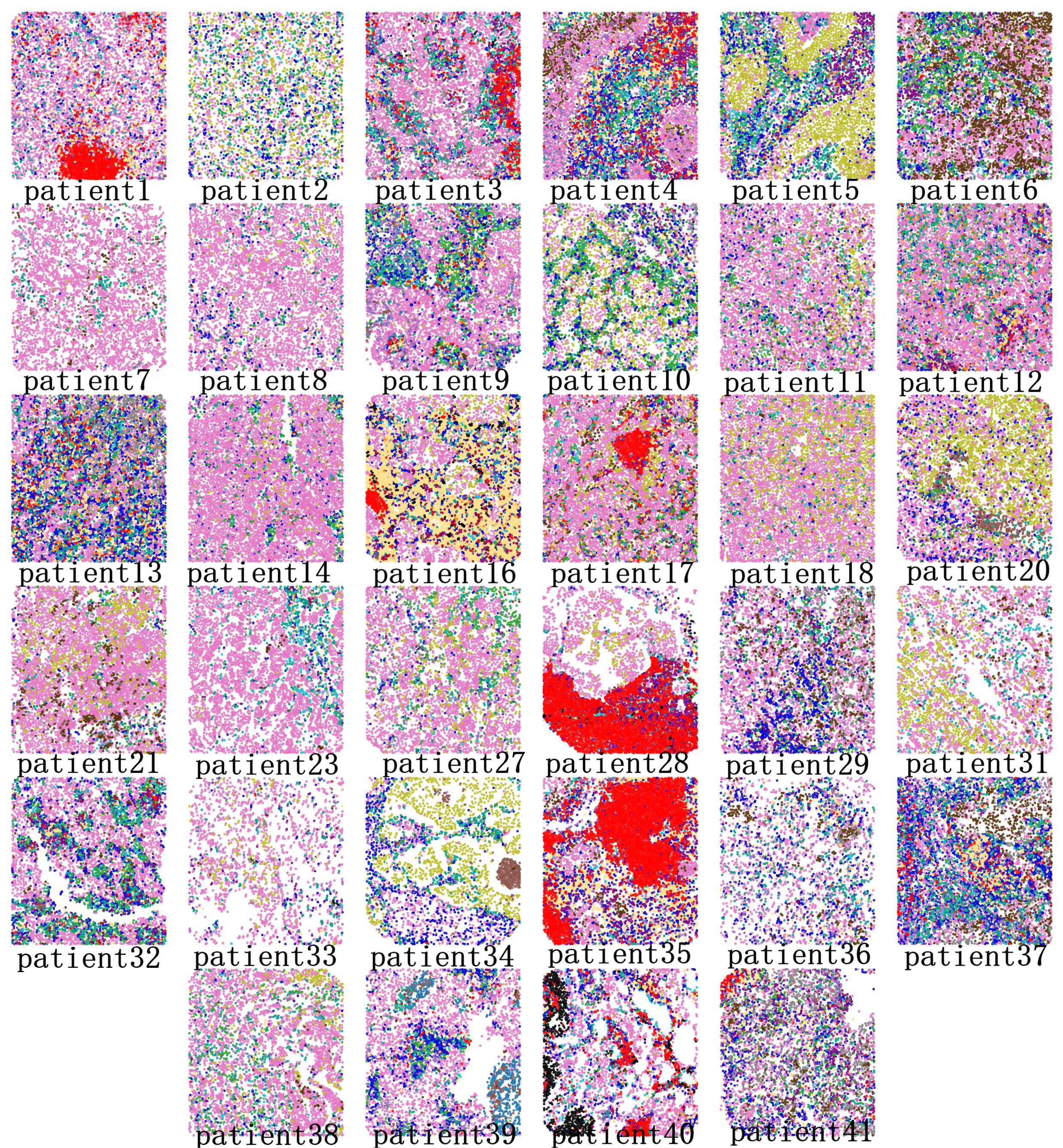
Output
After this step, we will obtain single-cell spatial maps colored by identified TCNs associated with image conditions/labels.
── CellType_Plot
   ├─ CellType_patient1.pdf
   |           ⋮
   ├─ CellType_patient41.pdf
   ├─ CellType_patient1.png
   |           ⋮
   └─ CellType_patient41.png
── TargetGraphDF_File
   ├─ TargetGraphDF_patient1.csv
   |               ⋮
   └─ TargetGraphDF_patient41.csv
── TCN_Plot
   ├─ TCN_patient1.pdf
   |         ⋮
   ├─ TCN_patient41.pdf
   ├─ TCN_patient1.png
   |         ⋮
   └─ TCN_patient41.png
TCN plot:

Cell type plot: